The Client
Repeat Roses is a social impact-meets-sustainability service. The organization charges wedding and event hosts a service fee to remove, restyle, and distribute their event flowers to charitable organizations. Finally, Repeat Roses recollects the flowers and containers for composting and recycling, diverting the event floral waste from landfills
The Problem
The floral industry contributes 1 billion pounds of waste annually in the US. Repeat Roses proposes a clear solution yet the business is rapidly outgrowing their current system of initial client interaction.
The Solution
We designed an online platform that lays out a streamlined process for clients to learn about the service, request quotes and communicate with the company
My Role
User research, interviews, usability testing, competitive analysis and content strategy
Tools
Sketch, Invision
The Team
Soul Won Cheung, Manoj Vasudevan, Kathleen Tucker
Time frame
Seven week-long sprints
Business stakeholder interview to understand the business goals & wedding industry research
Review of top customer service issues for insights into the current pain points
Competitor analysis to understand how competitors communicate their value proposition
User Interviews with usability study and card sorting to understand user goals, usability of the current website and potential new information architecture
Comparative analysis of websites for inspiration on how to communicate social impact & quote animations
I. Research
Understanding the domain
We knew the wedding industry is huge and there are companies similar to Repeat Roses, so narrowing the scope was important for this project. To get an idea of what the greatest needs and frustrations are in wedding planning and floral decisions, we familiarized ourselves with the wedding industry by looking at studies and reports online.
A 2014 study by The Knot showed weddings are becoming increasingly expensive despite guest lists getting smaller as brides are willing to spend more for meaningful and intimate weddings.
“Couples are focusing on creating an amazing guest experience and reception details, including finding unique venues to reflect their personality."
- Rebecca Dolgin, editor-in-chief of The Knot

Understanding the competitors
We continued our research by evaluating direct competitor websites. We also explored indirect competitors to help us qualify our research findings and provide additional insights as we began building our design direction.
Understanding the users
We turned our user research to interviews to better understand brides’ goals and frustrations. We interviewed three brides-to-be, three married women, and two engaged men to find out:
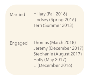
- Wedding planning methods and resources
- Emotions during different stages of wedding planning
- What needs differ at different stages of wedding planning
- What motivates users to practice sustainability
- What motivates users engage in charitable contributions
Usability Study
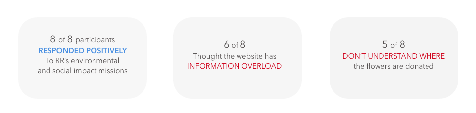
What we did: We asked our users to find information on the Repeat Roses website about how the business works, what impact the business has, how to request a quote, what is included in the service fee, and where the flowers were donated.
Objectives: We then briefed the participants about Repeat Roses and took our user research into a task based usability study to measure how well the original Repeat Roses website meets their wedding planning needs.
What they said
“I saw info on what the problem is and the negative environmental impact, but I don’t remember seeing anything on how they work to mitigate the issue.”
“Initially when you started describing the service, I thought, ‘WOW, I am so glad businesses like this exists.’ Then I didn’t get that same feeling resonate with me about their impact once I saw their website.”
“I don’t get the process. Is Repeat Roses a florist? Do we buy the flowers through them?”
Some of what we found
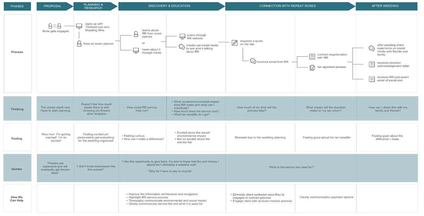
Repeat Roses Customer Journey Map
Emotional Complexity
They experience similar excitements and frustrations at some parts of the journey, but sometimes, their feelings differ from time to time.
Anxiety before the Dawn
Bride and Grooms are experiencing more intense emotions and stronger feelings closer to the end of wedding planning
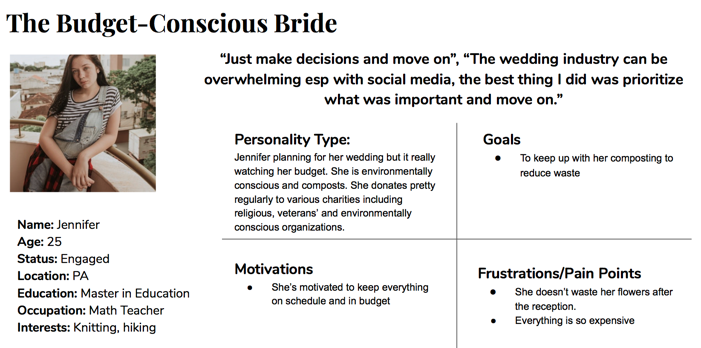
Based on those insights, we created two personas that encompass our users' goals and frustrations.

II. Defining our problem
Our client wants us to design an effective way for the prospective clients to learn about the service, request quotes, communicate with company, register, and pay for the service.
We not only uncovered the need to improve the quote process but also identified a different need for all our users: there is too much information on the Repeat Roses website and participants are overwhelmed. By addressing this need, we believed we could bring the most value to Repeat Roses.
To address the problem, we came up with five design principles to guide our solution:
- Make “Requesting a quote” more accessible
- Simplify the information on how the process works
- Reduce the amount of copy and images
- Make service fee more transparent
Use infographics to communicate RR impact.
III. Bringing ideas to paper
We used the following questions to guide our ideation:
- How can we create a simplified quote and onboarding process for brides?
- How can we show brides concise information about how Repeat Roses works?
- How can we alleviate brides’ questions service fees?
- How can we communicate the social and environmental impact?

ex. Sites like Oscar skip personal information when requesting quotes and users can add personal information in later once they create an account.
For most concepts to work, we needed to incorporate an onboarding process so that we could understand how similar companies communicate values to encourage brides to enter necessary quote information. As apart of my research, I looked at health insurance sites to study how they collect information about new users while maintaining a low barrier to entry.
IV. Iterating our design
We converged the following concepts: onboarding and requesting a quote, content strategy, simplified navigation, and infographics to communicate Repeat Roses' social impact meets sustainability mission.
We considered content more carefully, making sure to bring clarity to service fee and tax benefit information.
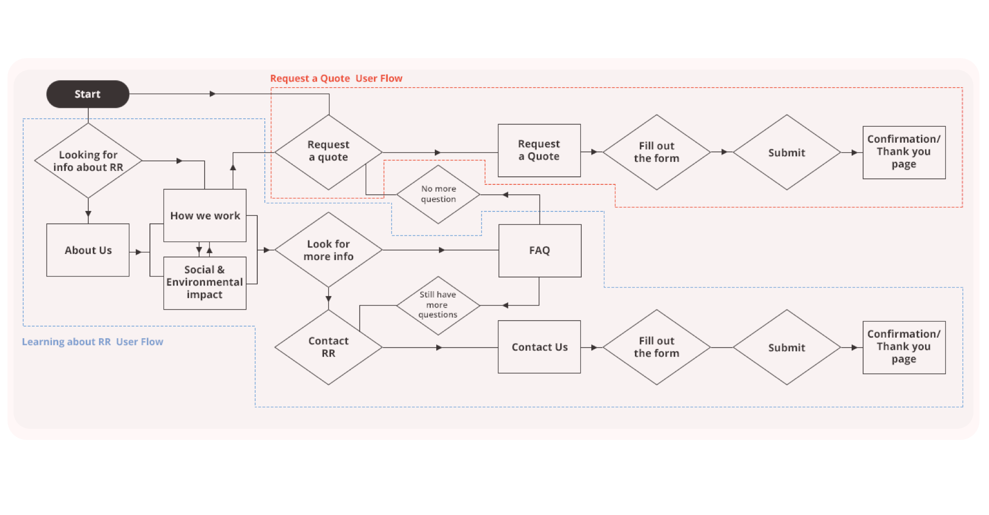
User flow
I lead the creation of the user flow that addresses the business and user goals. We used this as our guide for information architecture and content strategy throughout the design process.
Sketches
We started our visual design process with some visual thinking, here are some samples from that process:

Low-fidelity Prototype
An early version of our clickable prototype for learning about Repeat Roses and requesting a quote can be found here
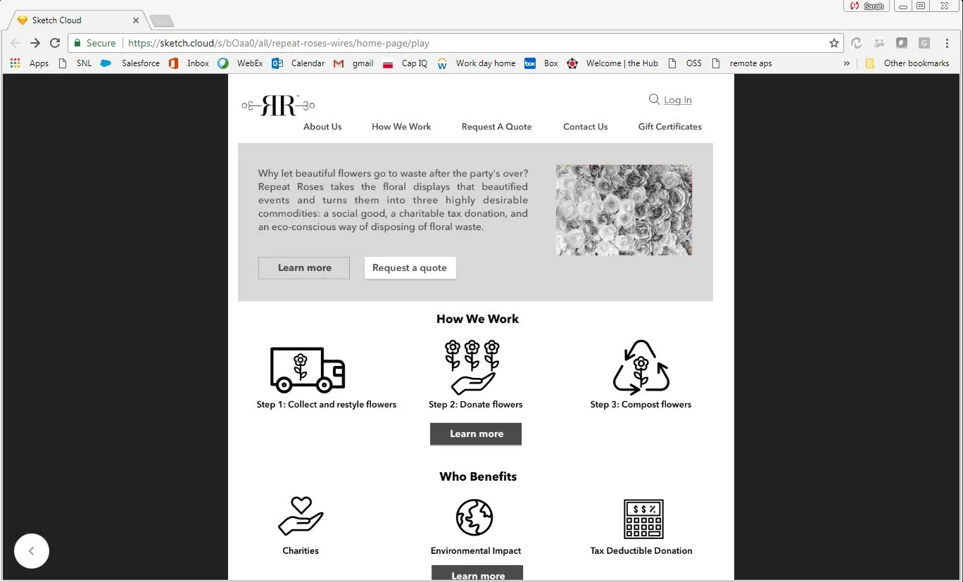
We then moved into Sketch and InVision to design our low-fidelity prototype to determine our user flow for information architecture, key features and functionalities.
Our low fidelity prototype focused on three core features: simplified navigation, info graphics to communicate the company's impact & clarification on the quote process
Below is a comparison of the Repeat Roses original website to our early protoype, I have annotated our design principles
Repeat Roses Home page. Users are confused and often mistake the business for a charity. We have simplified the homepage and highlighted key service information, simplified the navigation and added call to action buttons that align with our user flow
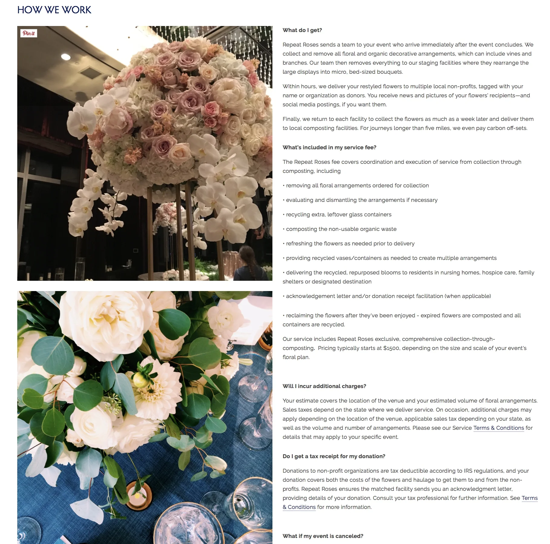
How We Work functions as a FAQ section and highlights key business information. Users were frustrated by the amount of copy and they did not fully understand how the service works or what the business impact is. We included infographics to help communicate both service and impact
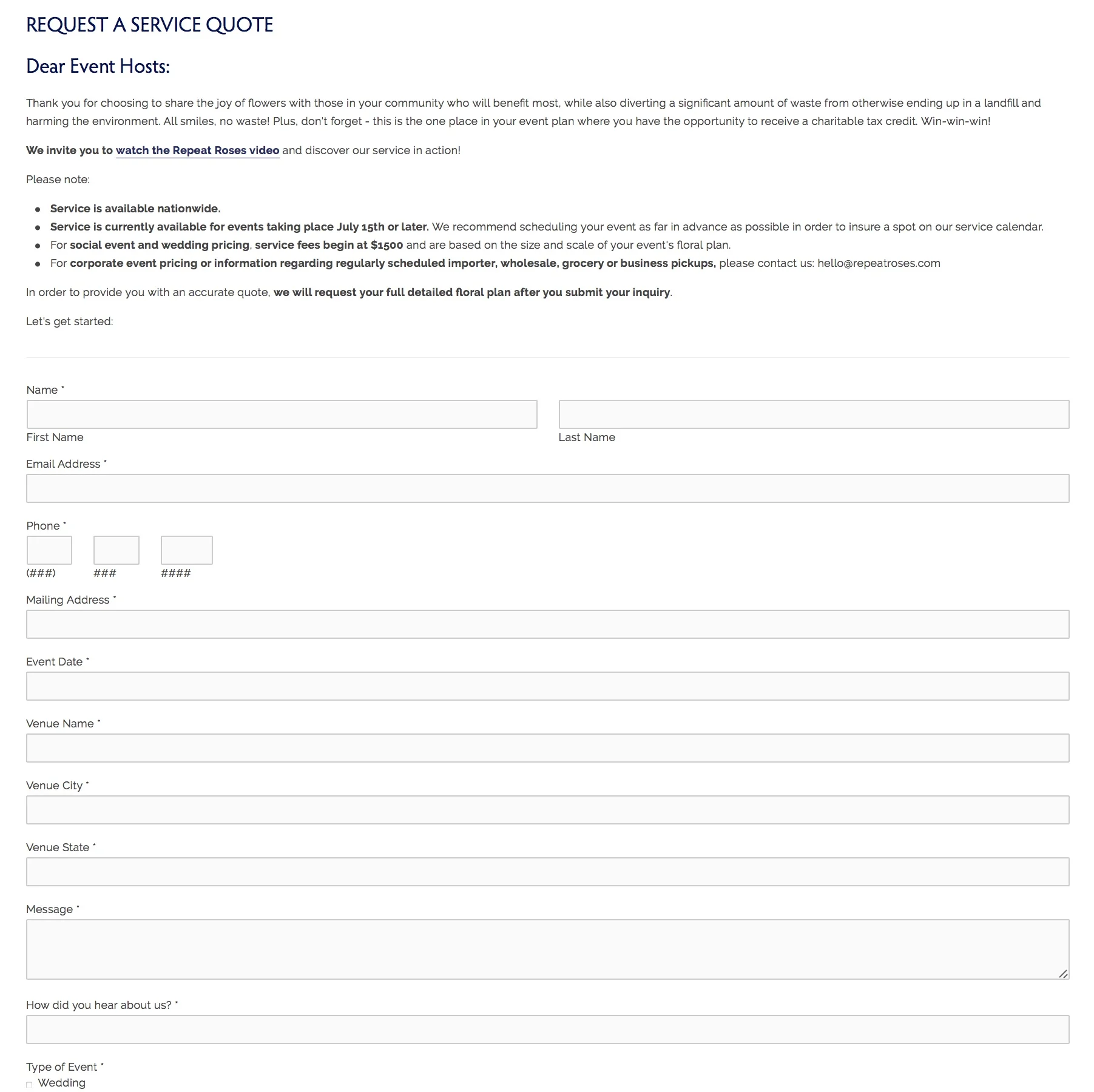
Requesting a service quote is buried in the top navigation. We also decided to change from a web form to an interactive quote animation.

V. Usability Testing
We tested a total of 4 users (3 brides and 1 groom)
User Testing Objectives
Learn about the service - how the service works, social & environmental impact, tax deductible service fee
Request a quote
Contacting Repeat Rose
Focusing on:
Ease of use
Ease of finding information
Navigation
Content
Images
I lead the usability testing of our prototype.
We asked users to tell us what they expect to see, complete different tasks on the site and find information and rank their experience on a scale of 1 to 10, 10 being the highest.
Key Findings

VI. Heuristic Evaluation
After making the low-fidelity prototype, our team performed a heuristic evaluation. We made several important improvements, including:
- We found issues with our image selection and decided to do more research on effective infographics
- We improved user freedom by adding “Back” buttons while requesting a quote.
- We made the tone of the website reflect the business mission and chose to increase the visuals to resonate the impact.
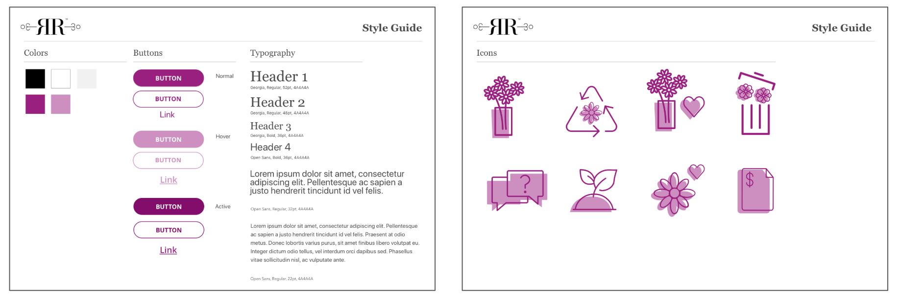
VII. UI Research & Style Guide
We performed research about how people interact with and use web interfaces to inform our UI design decisions. Below are some insights:
- Dexterity: moving interface elements like pull down menus and walking menus, can be problematic for navigation. We decided to use static user interface widgets and ample white space between elements to facilitate easy navigation and selection.
- Vision: to ensure readability, our text is size 18pt or larger. The strokes on our buttons and other containers are also high in contrast. We also selected a color palette that passes the Web Content Accessibility Guidelines (WCAG) AA standard defined by the World Wide Web Consortium (W3C).
We drew conclusions from our Heuristic Evaluation and UI Research to develop our style guide:
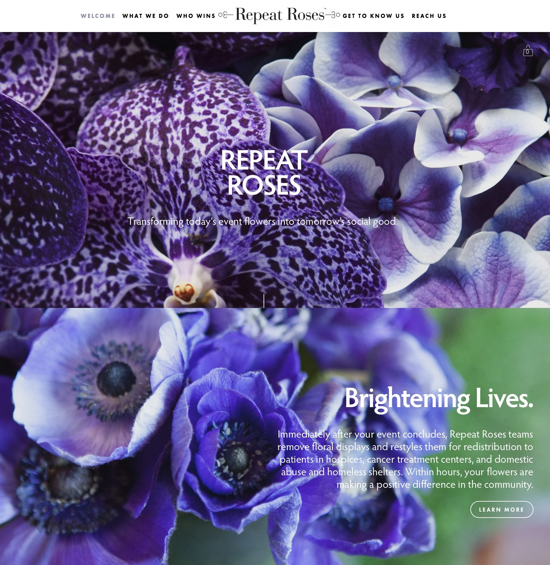
VIII. Final Design
As we continued our research, we moved to high-fidelity prototypes and went through various design iterations.
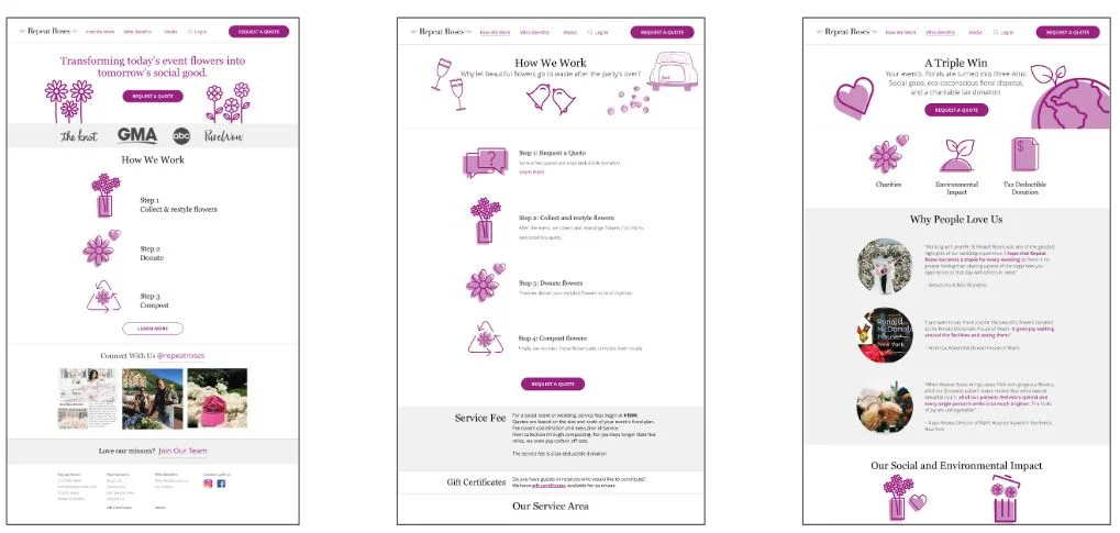
High contrast homepage with minimal text Simple infographics to communicate service details Customer storytelling and business mission communicated in one page
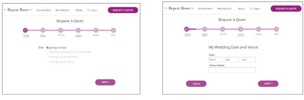
Animated request a quote process with added a progress bar Added back buttons to allow users more freedom when filling out form
Click through our final design
XI. Refection
What I learned
Next Steps
Create an effective design solution aligning business and user goals.
Effectively execute the UX process as a team.
Coordinate design activities with multiple teams.
Communicating service vs. communicating mission.
A/B testing with the current design vs new design to determine usability and conversion improvement
Integrate with the design for post-quote process.
Development hand-off